NUDE MINTS
Services
Brand Strategy, Creative & Art Direction, Packaging Design, Web Design, Ads & Campaigns
Client
NUDE North America
Location
Las Vegas, NV, USA
Year
2020-2026
Making the World's Most Advanced Mint that Impossible to Ignore
Overview
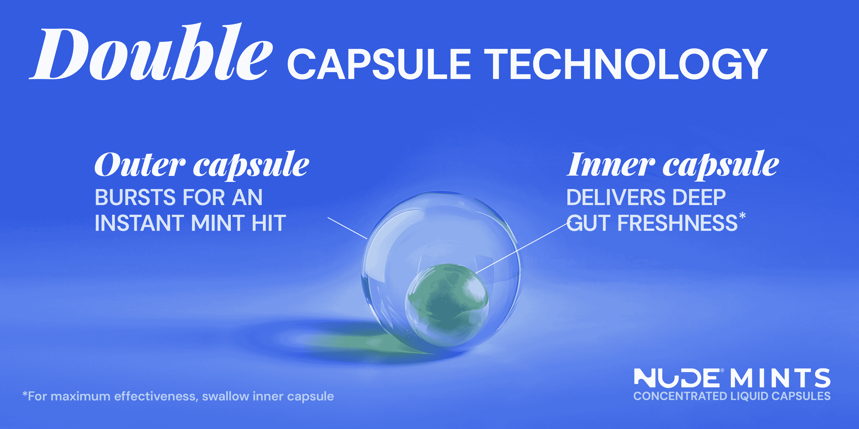
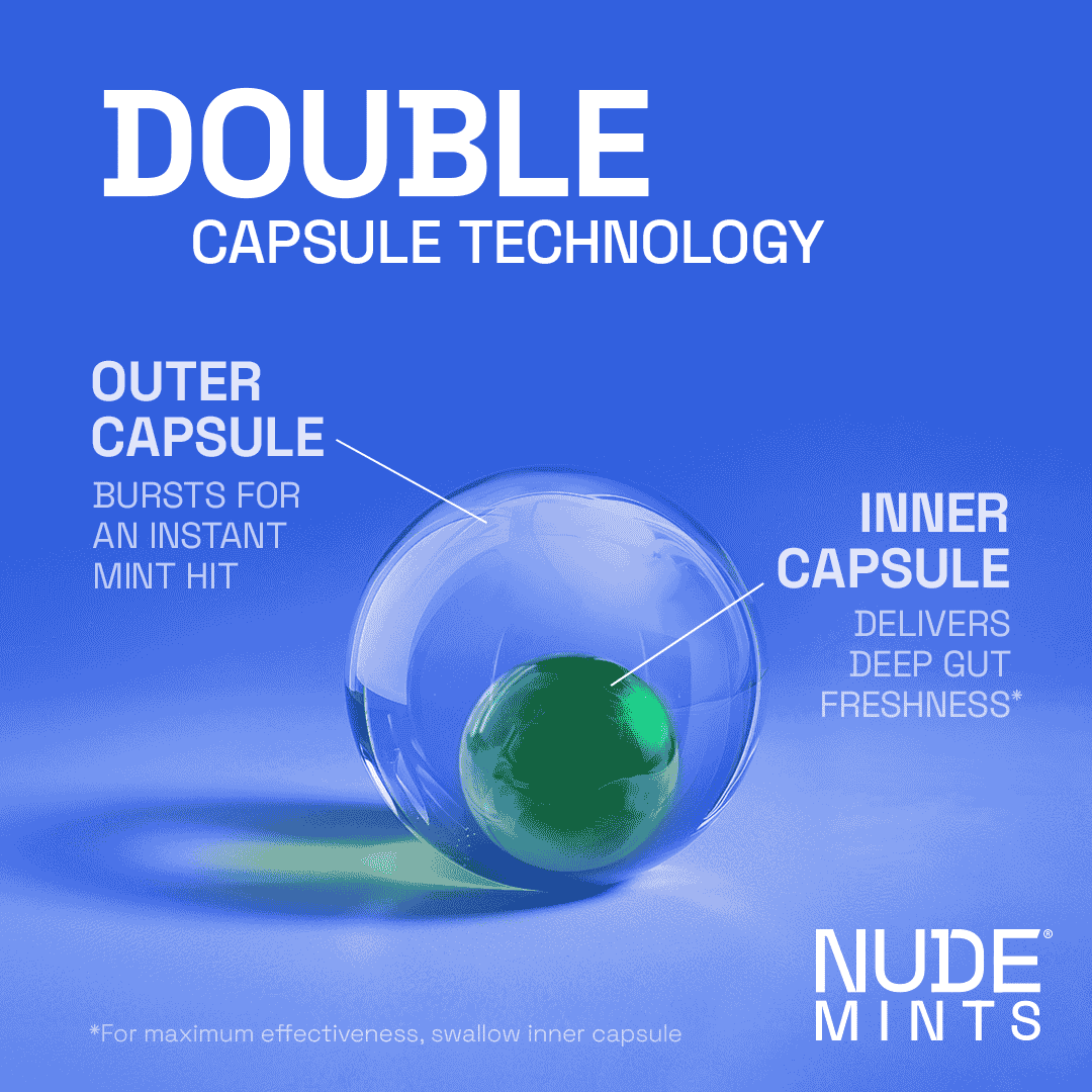
NUDE Mints is a patented dual-action liquid capsule mint - the only product in its category that eliminates bad breath at the source while supporting gut health.
Entering a market dominated by legacy brands with decades of shelf presence, the brand needed more than a refresh. It needed a complete repositioning to justify its premium price point and communicate technology that had no direct competitor.
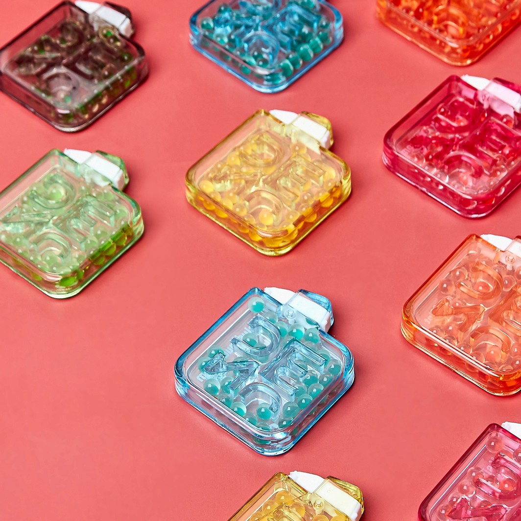
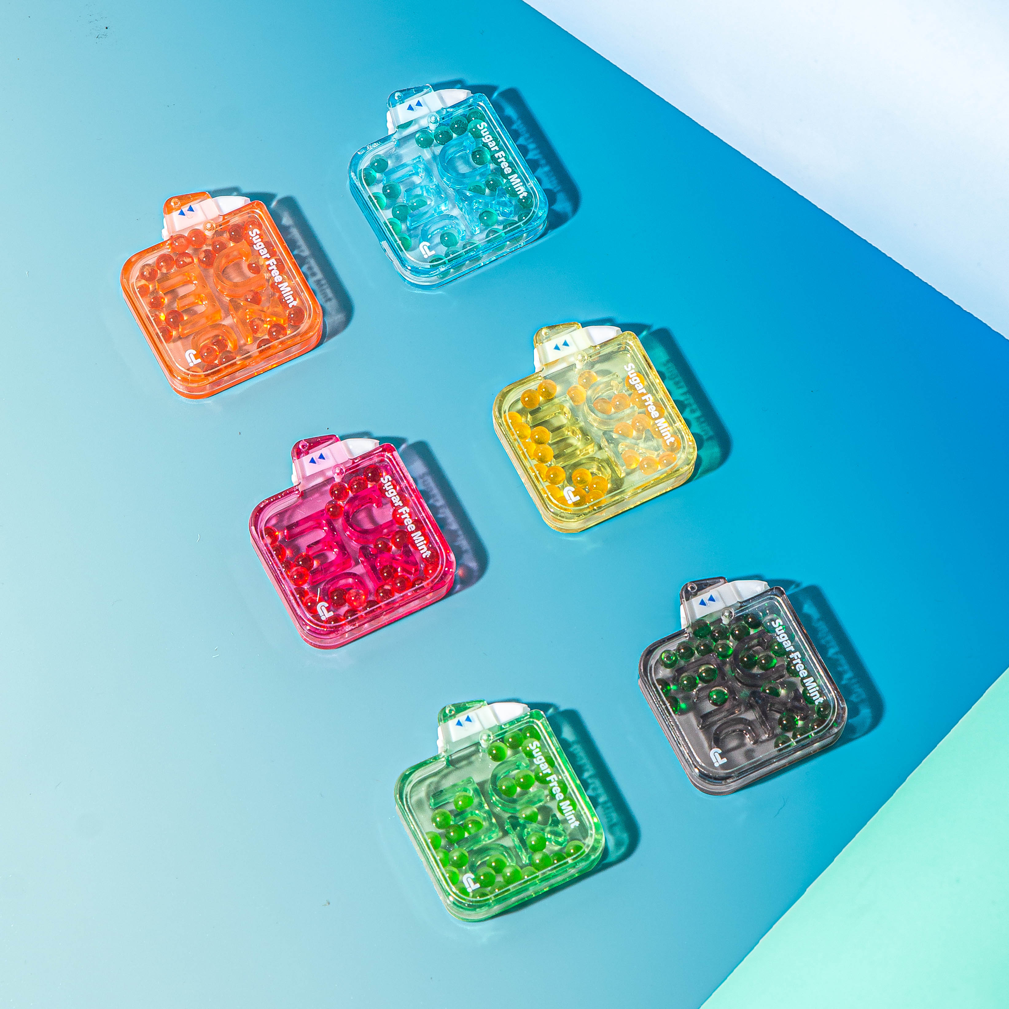
Packaging
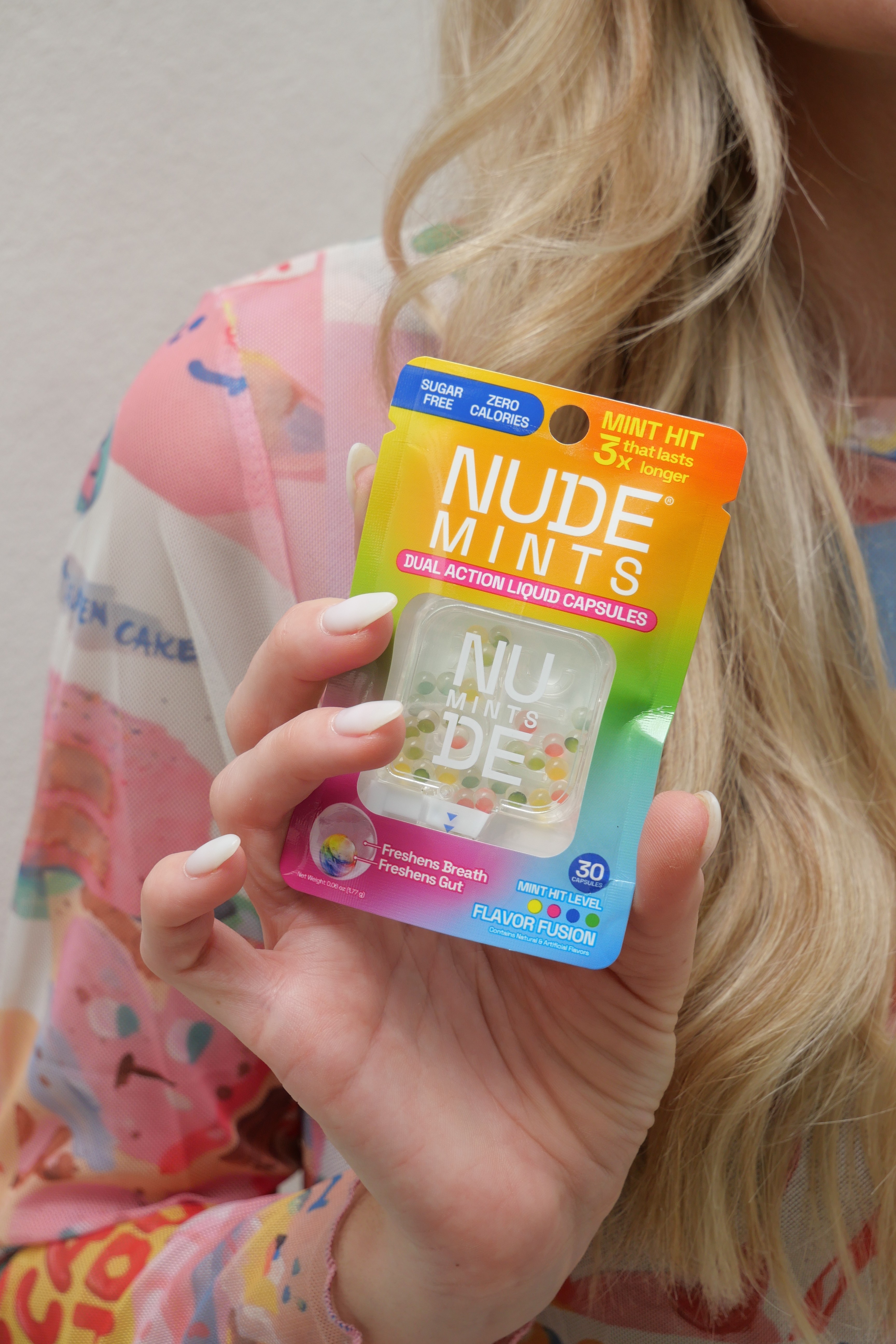
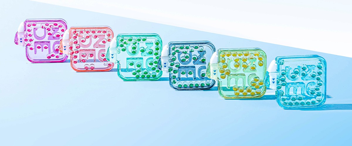
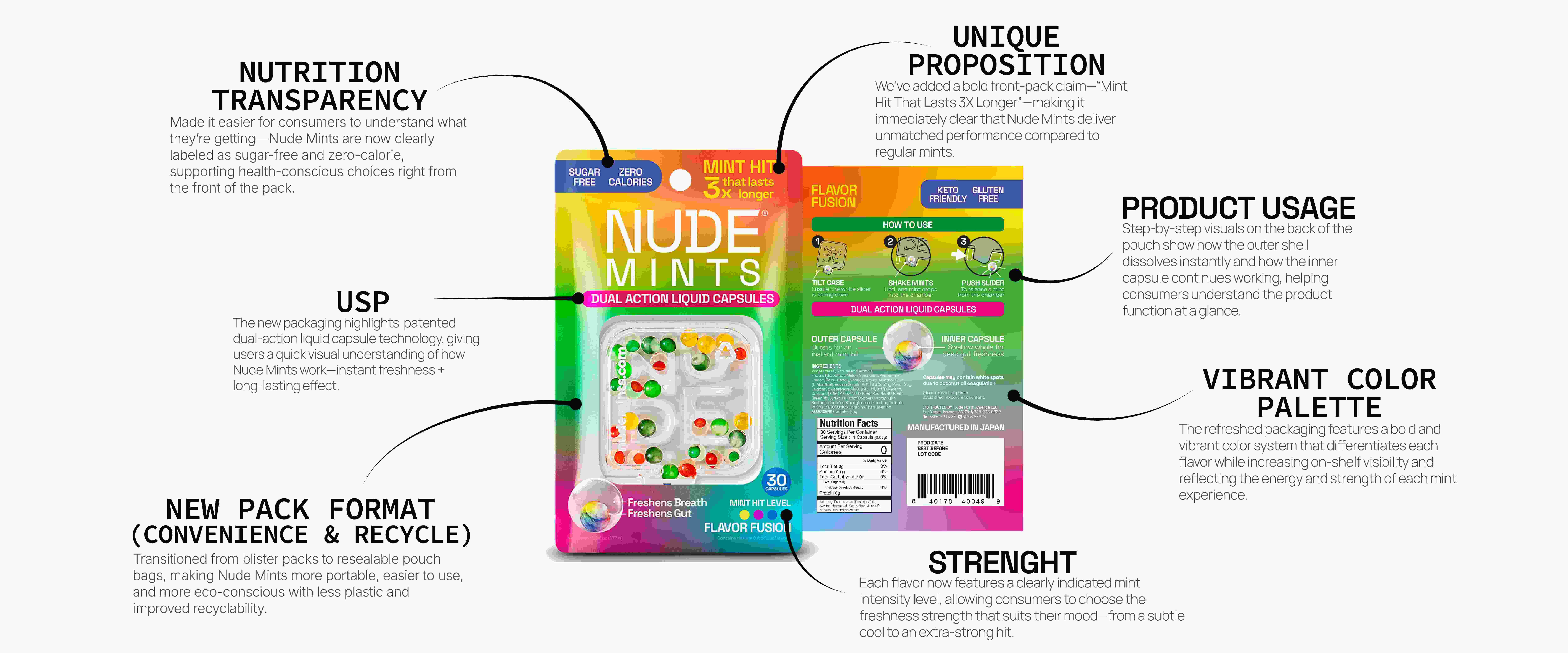
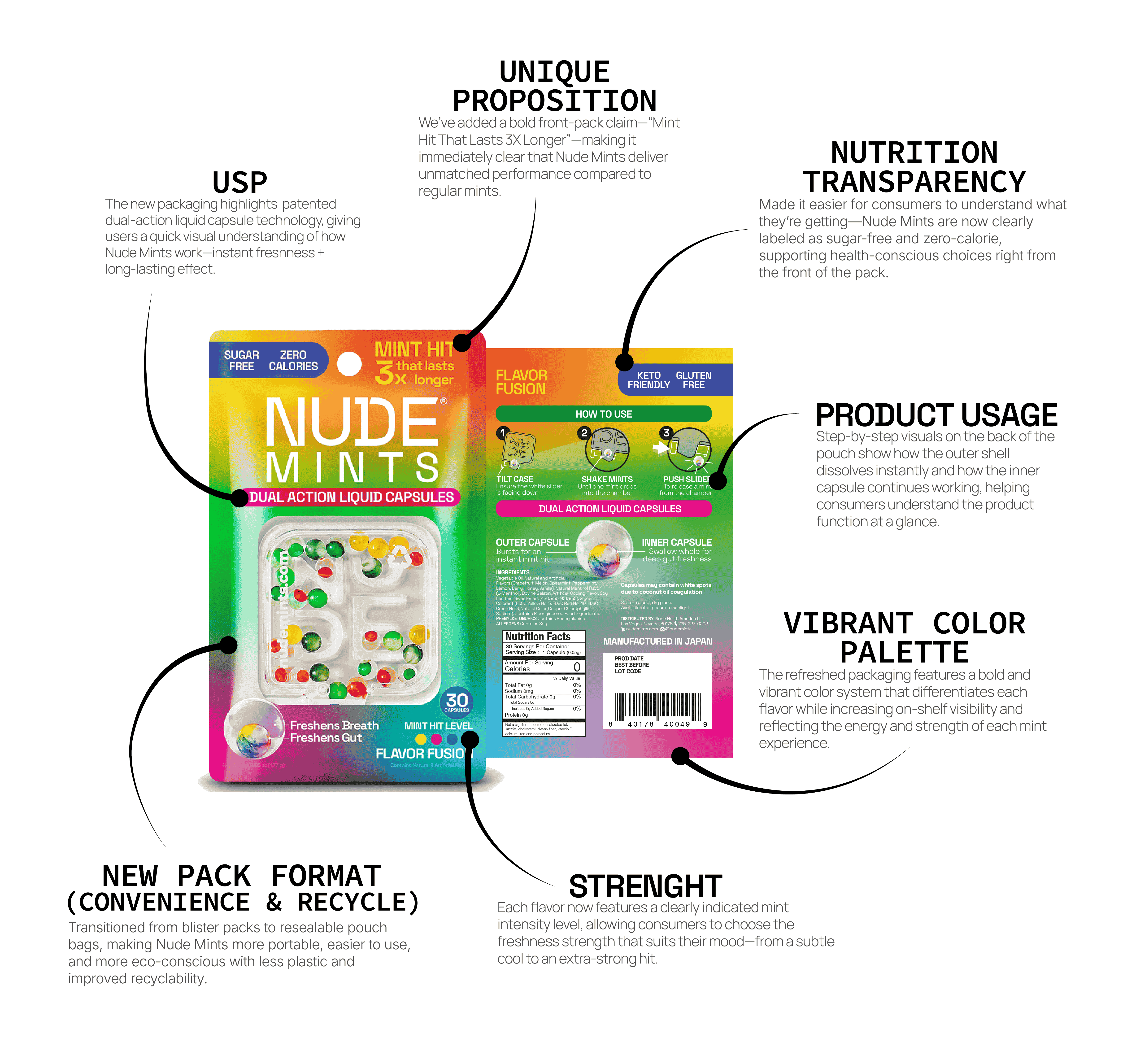
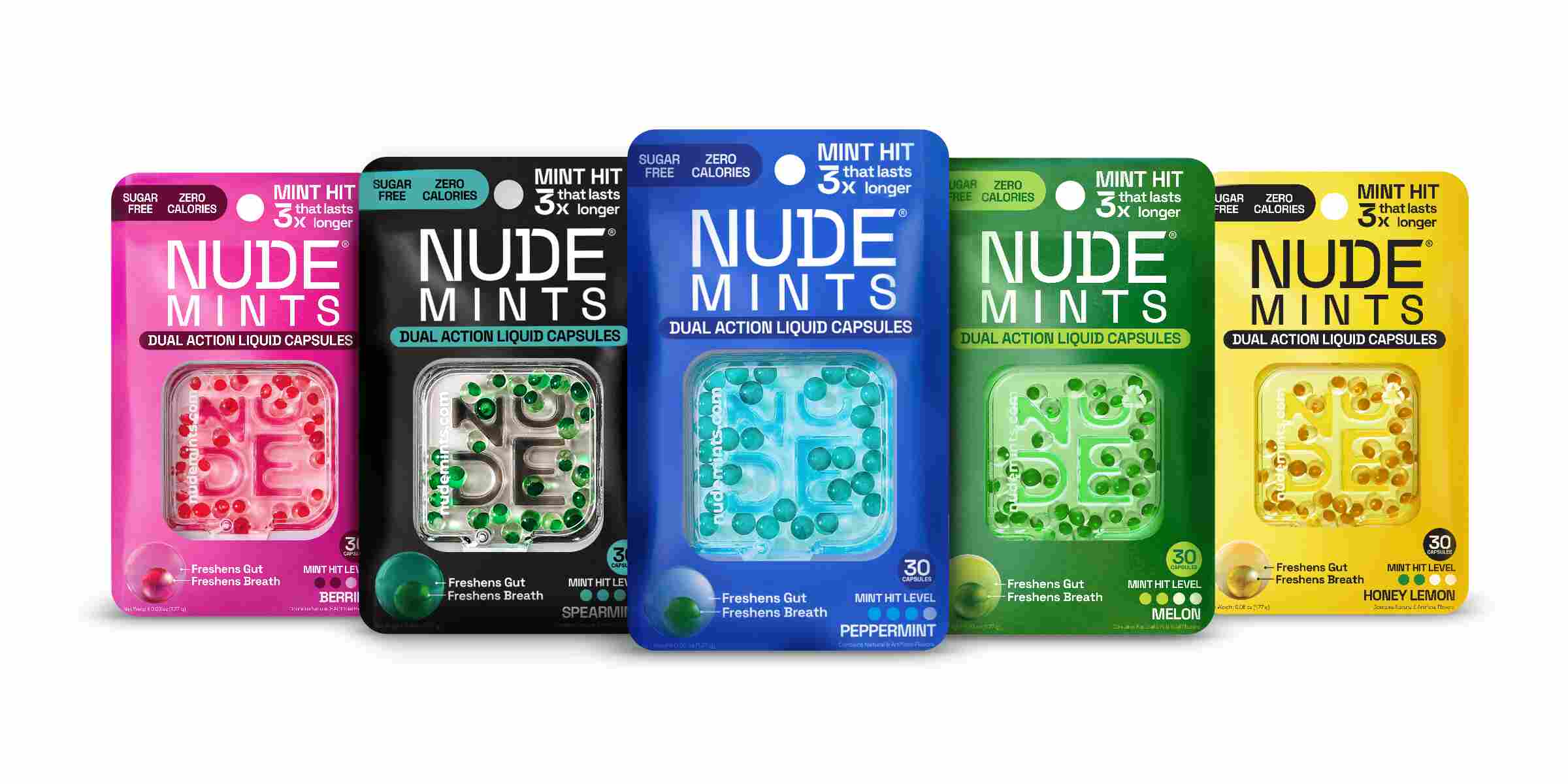
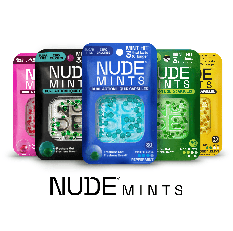
Packaging was the highest-stakes deliverable of the entire project. For a product at a premium price point with technology that's invisible to the naked eye, the blister pack and container had to do something most packaging doesn't:
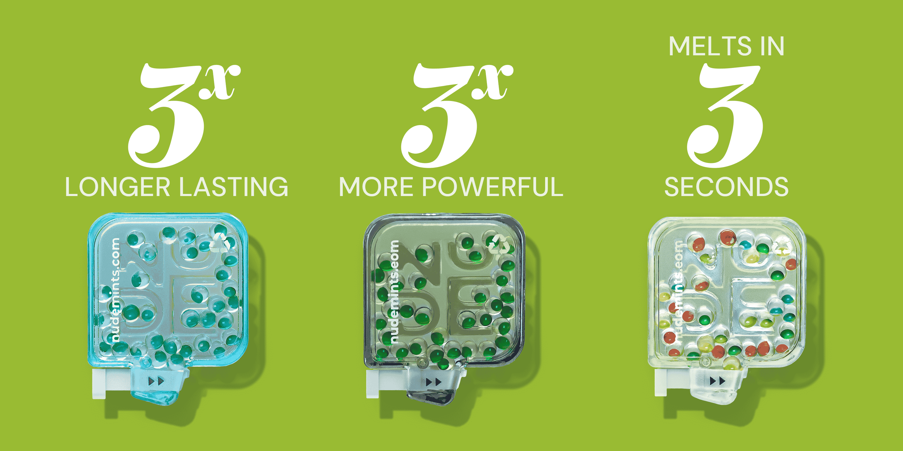
The redesigned packaging communicates the "dual-action " system - instant outer-shell activation in 3 seconds, sustained inner-capsule freshness - clearly at point of sale. The hierarchy was restructured so that a consumer encountering NUDE Mints for the first time could understand the core value proposition without reading the back of the pack.
The new direction was informed by years of shelf-performance observation and direct consumer feedback, translated into a creative brief that guided the design team toward something functional, premium, and visually disruptive.
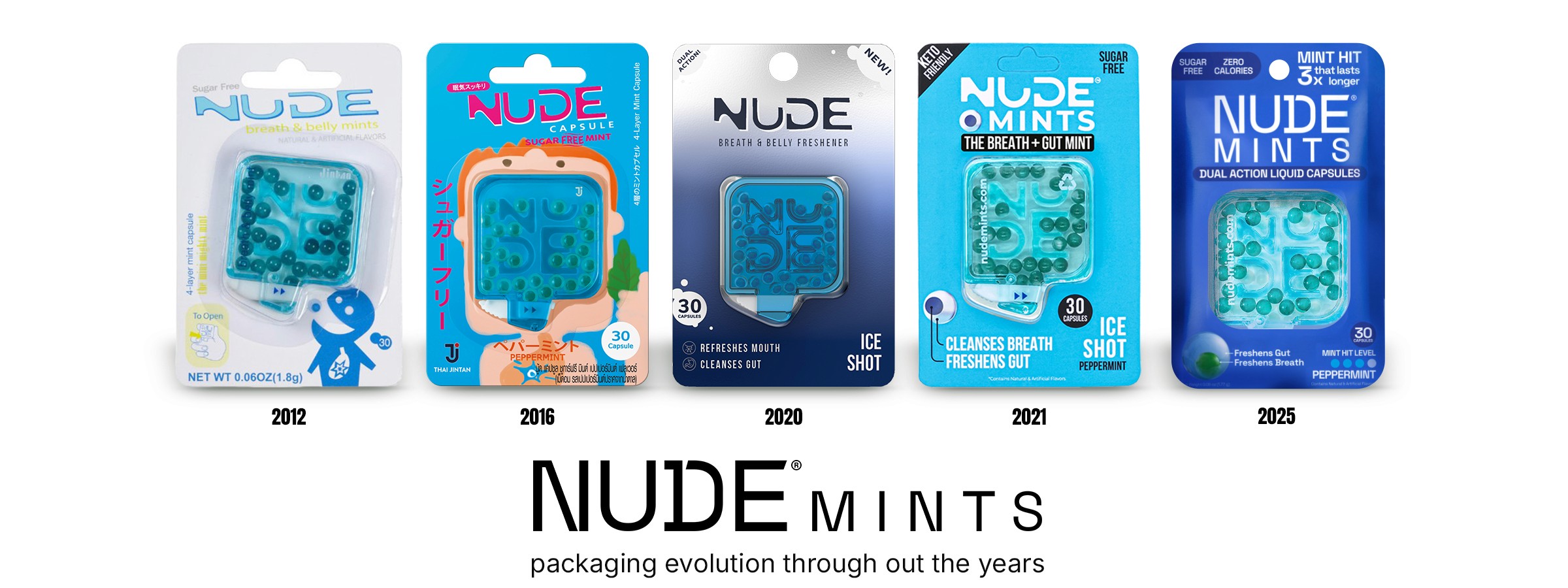
Brand strategy & identity
IDIs interviews and competitive analysis across the mint and wellness category revealed one clear gap: a category with decades of stagnation and no brand willing to redefine what a mint could do.
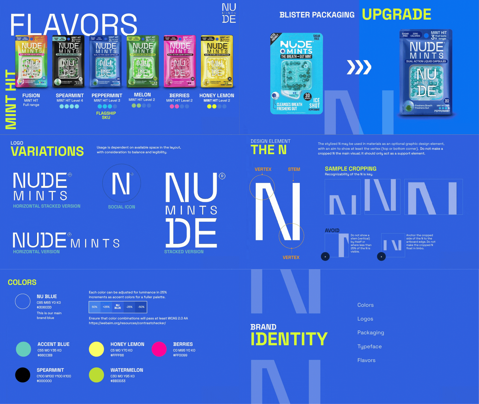
That insight drove the new positioning - World's #1 Smart Mint - targeting efficiency-obsessed professionals who optimize everything, with a secondary lens on trend-driven Gen Z consumers chasing something new. Strategy, personas, voice, and campaign direction were consolidated into the 2025 NUDE Mints Brand Guidelines, aligning the entire team around a single creative vision.
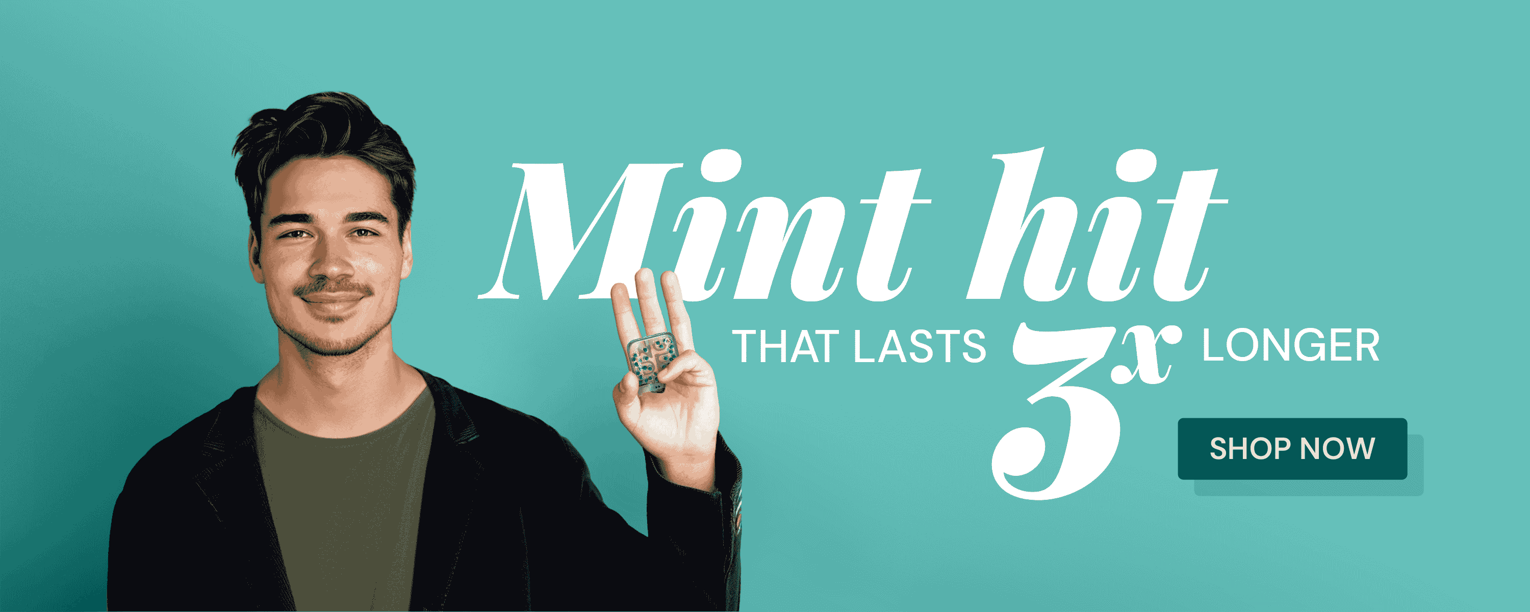
The identity followed the strategy. Out went soft wellness aesthetics. In came electric blue, heavy display typography, and a bold graphic language built to feel closer to a performance brand than a mint - confident, modern, and impossible to miss on shelf.
Web Design
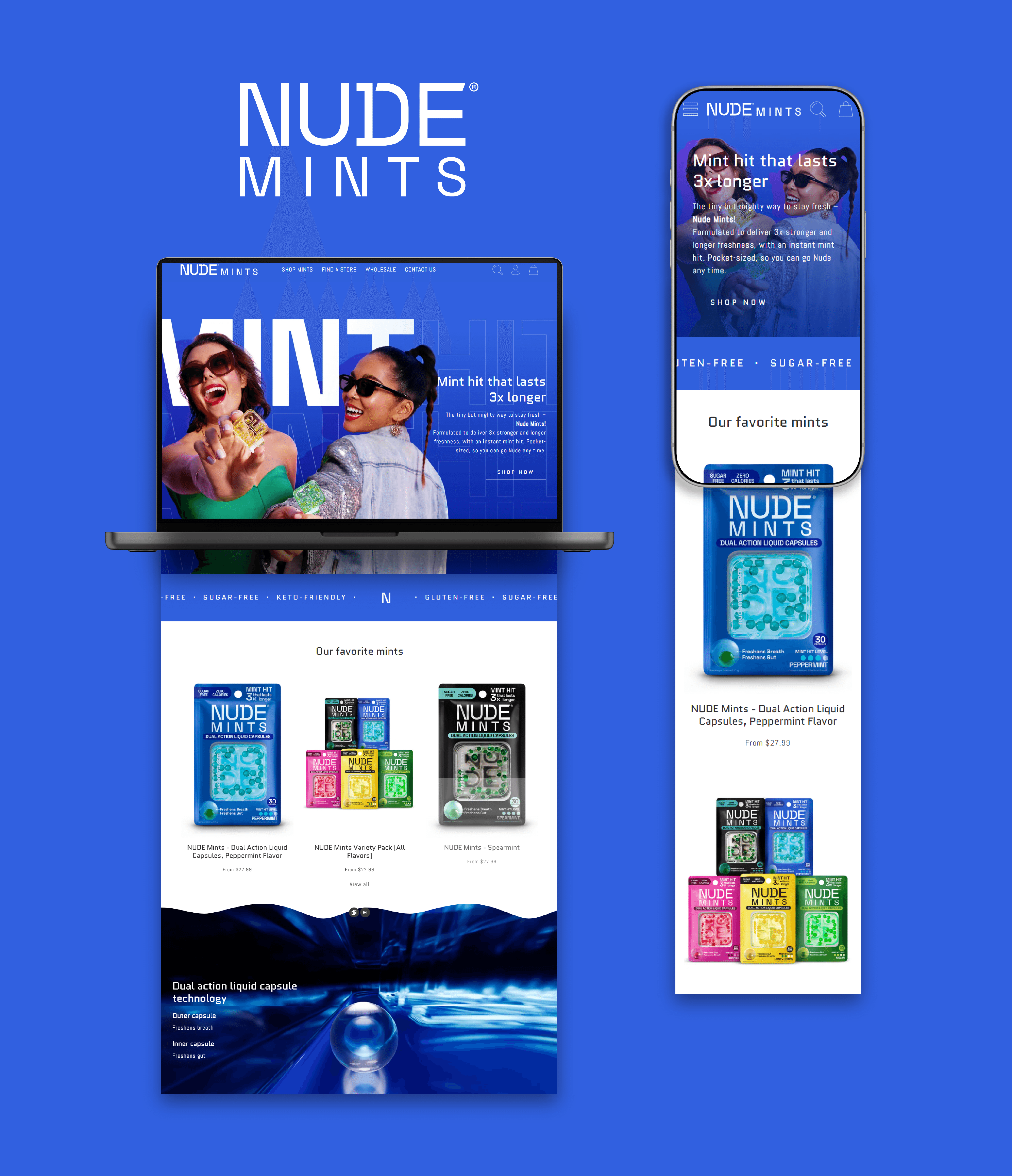
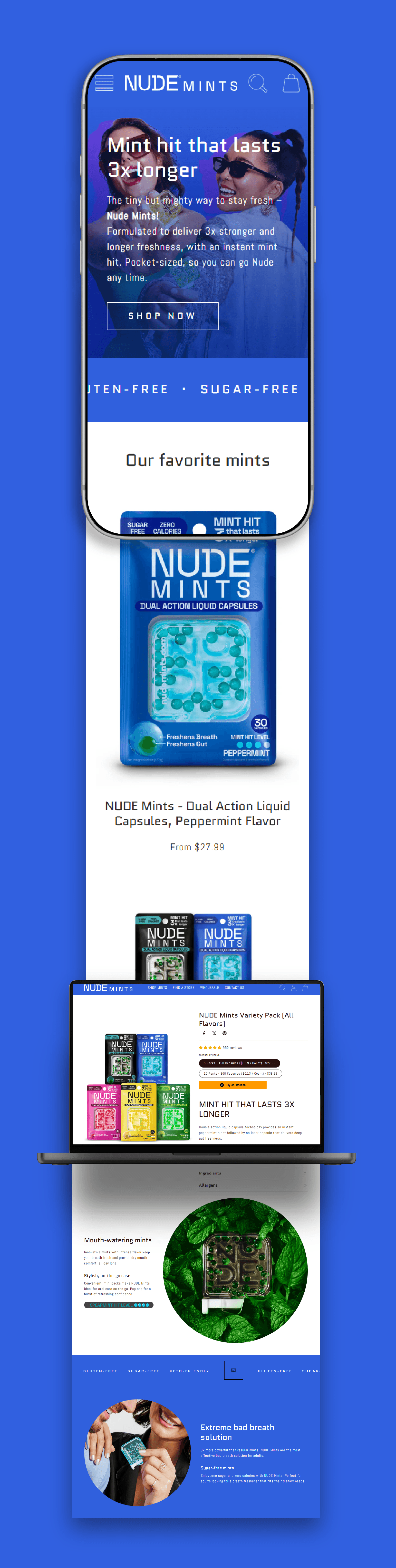
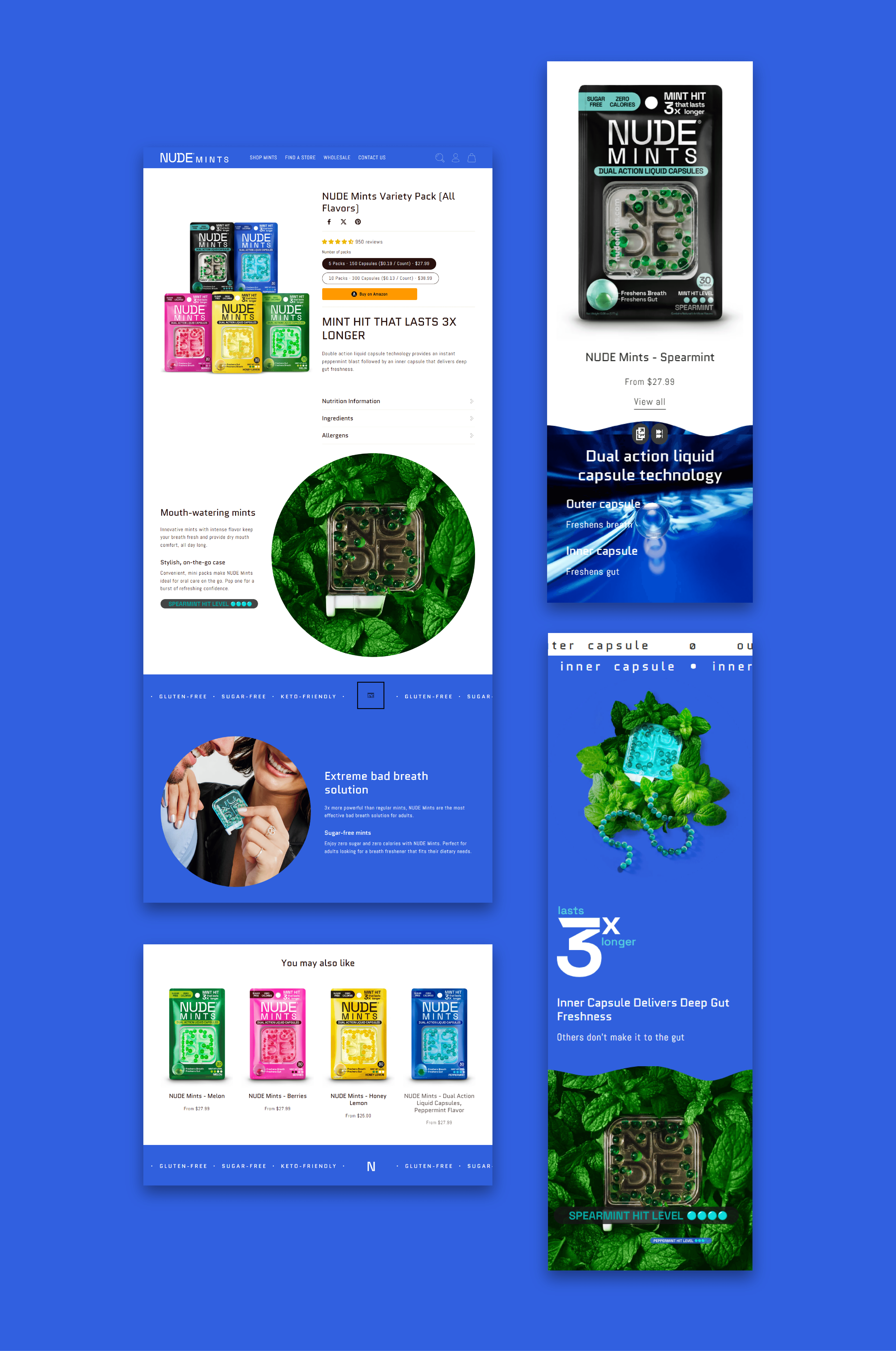
The website was redesigned to reflect the new brand positioning and serve as the primary owned channel for consumer education. The goal was to communicate the dual-action technology clearly and quickly - turning a complex product story into an intuitive, conversion-focused experience that could move a first-time visitor from curiosity to purchase.
Social & digital ADS
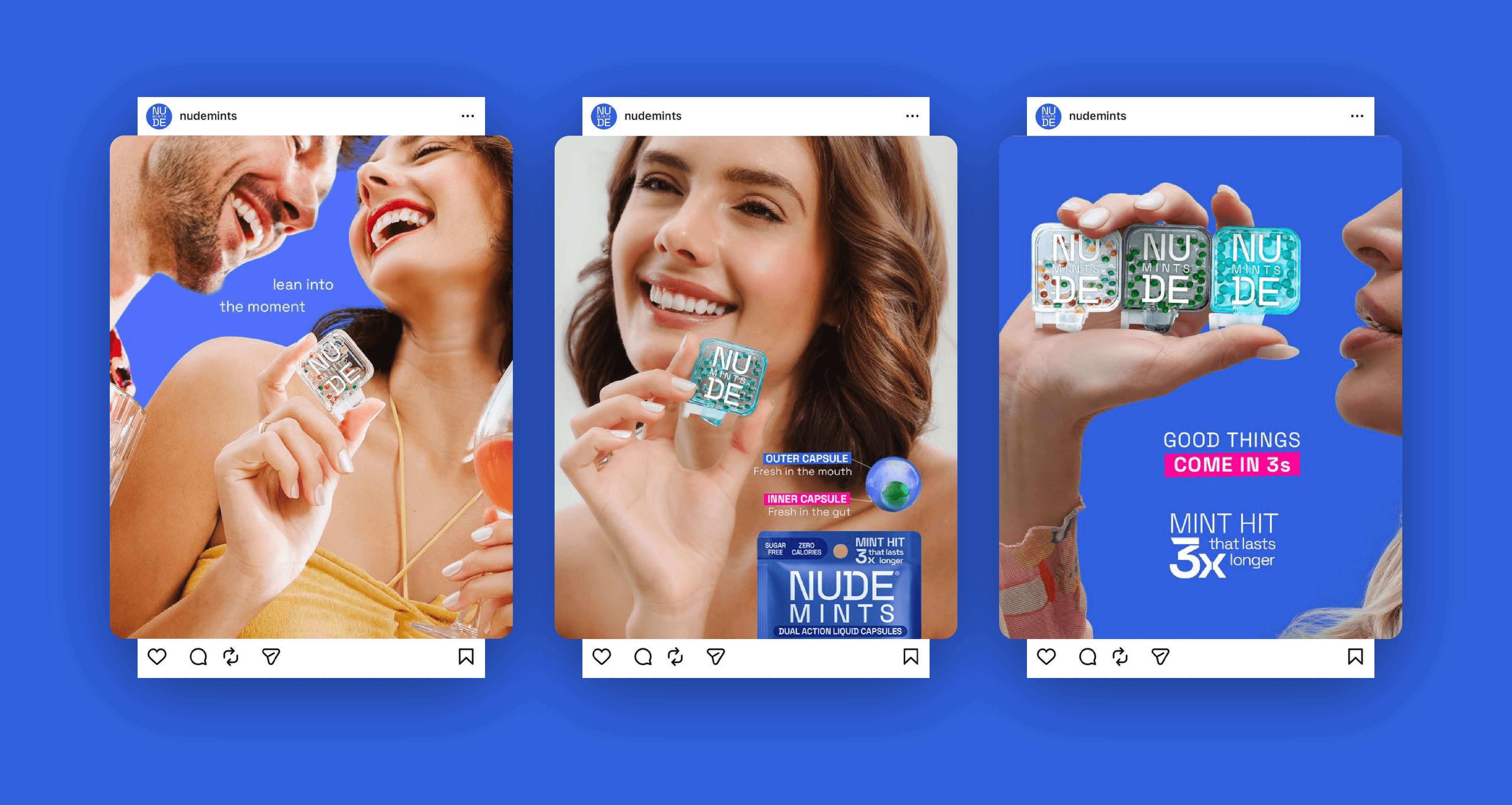
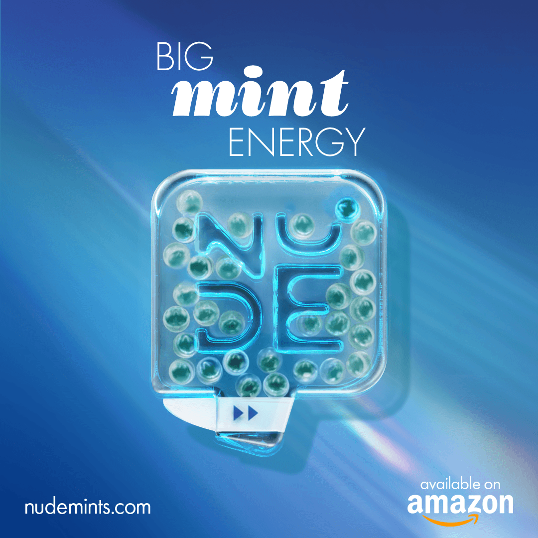
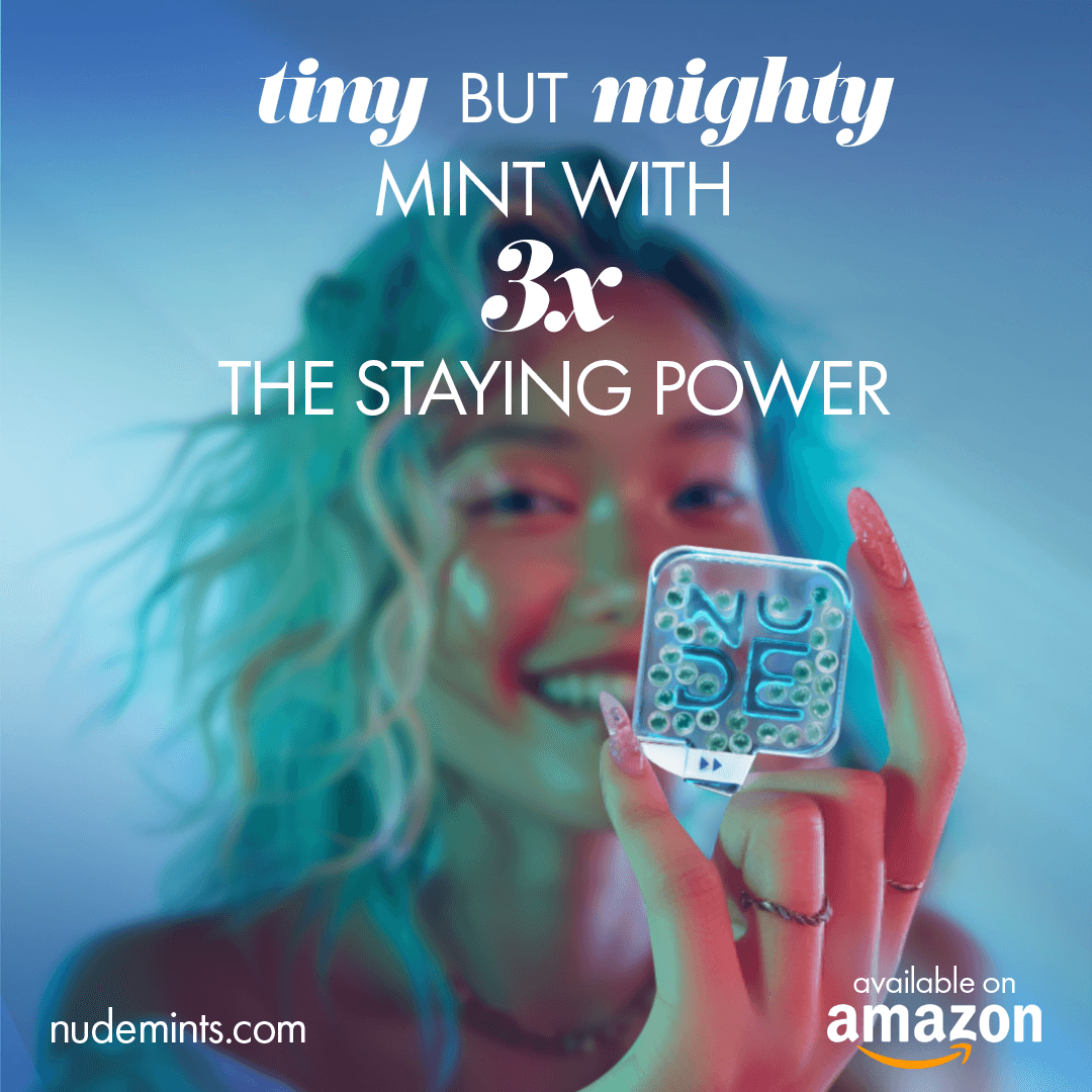
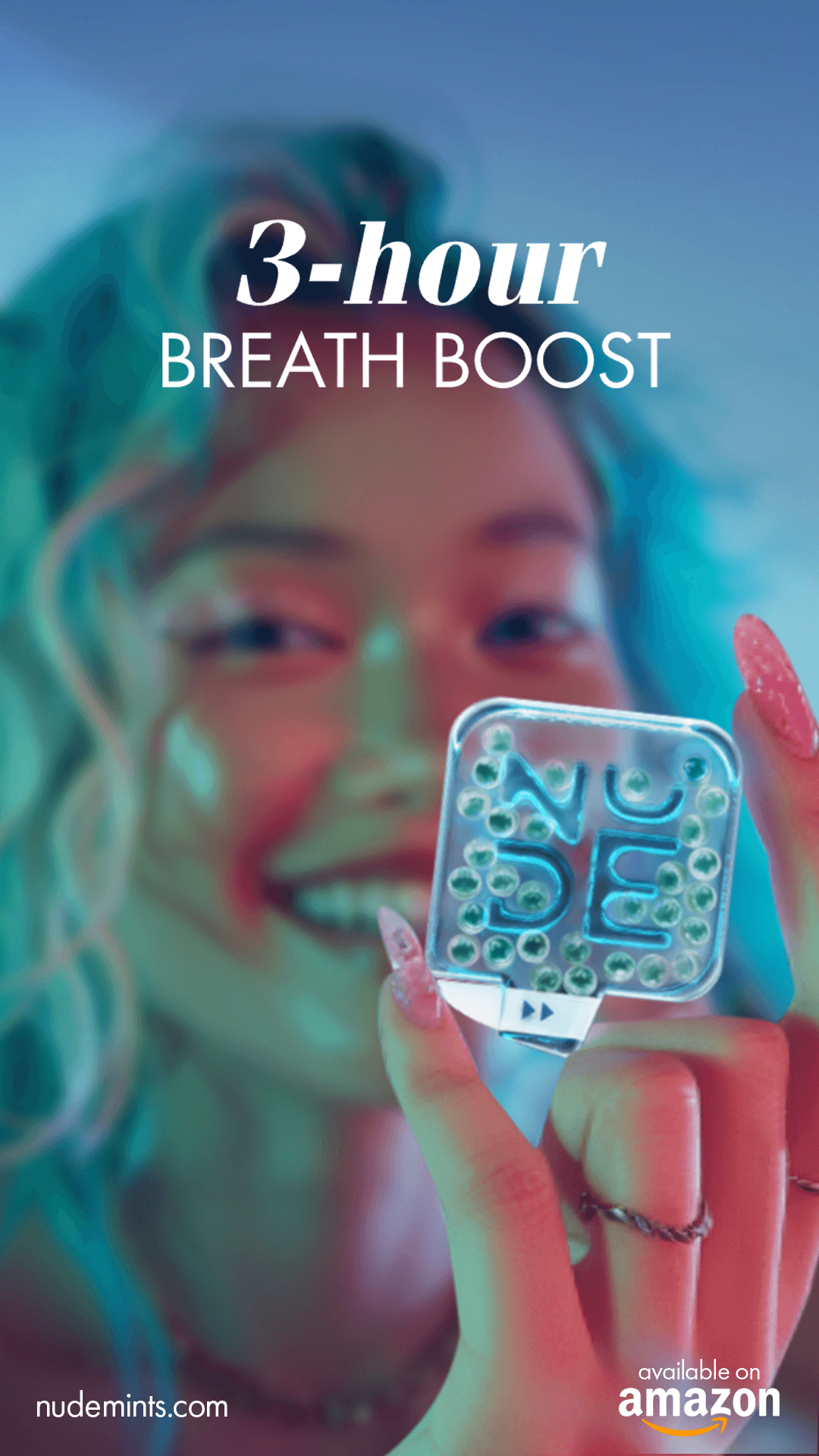
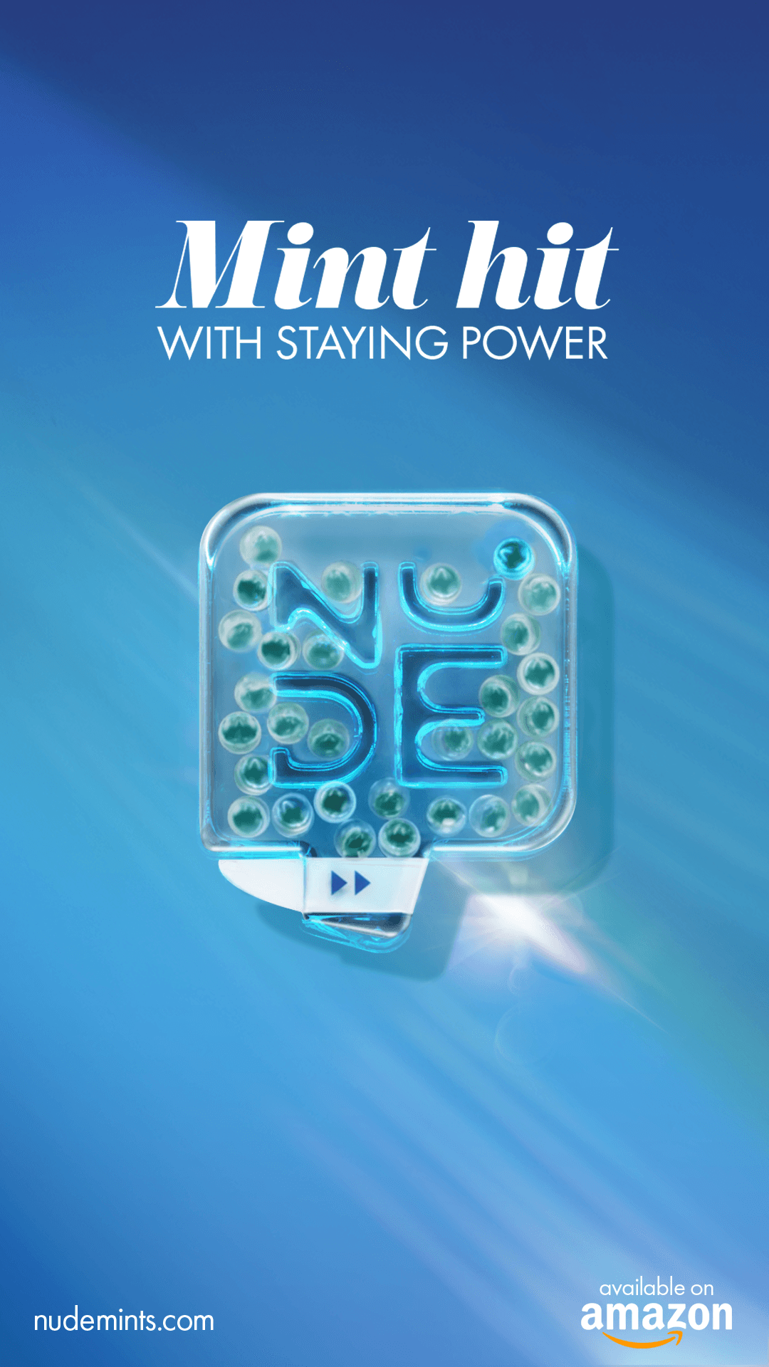
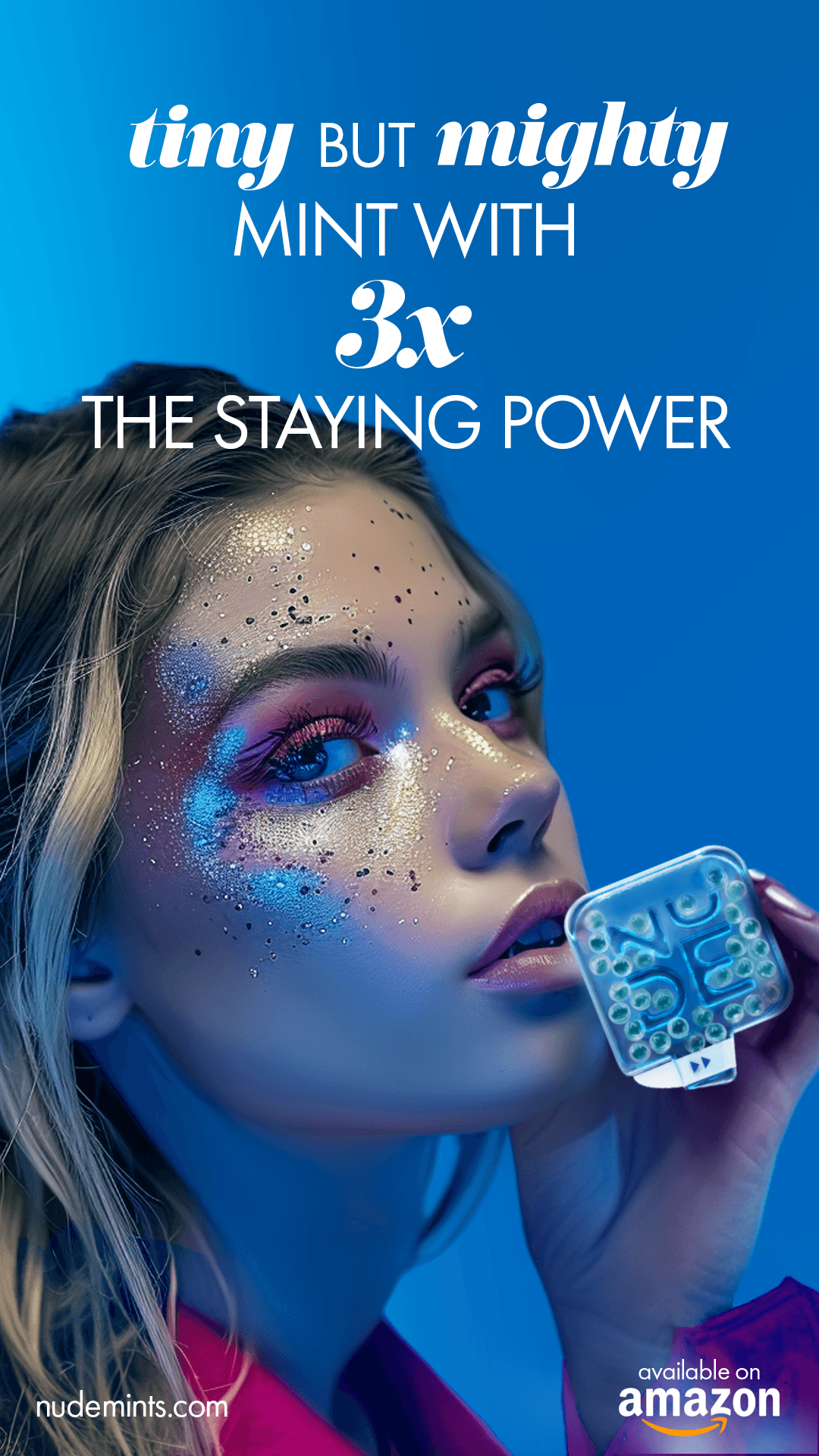
Paid and organic social were built around one strategic challenge: making invisible technology visible. Ad creative leaned into demonstration - edu-tainment formats that showed the product working rather than just claiming it did. Every asset was developed with a dual purpose: strong enough to stop the scroll as paid media, authentic enough to live as organic content.
UGC
I developed detailed content briefs for each activation type, each structured around authentic proof rather than scripted promotion.
Brief formats included:
real-time first-impression reactions (the 3-second dissolve, the Mint Hit),
multi-checkpoint freshness tests at 10, 30, and 60 minutes
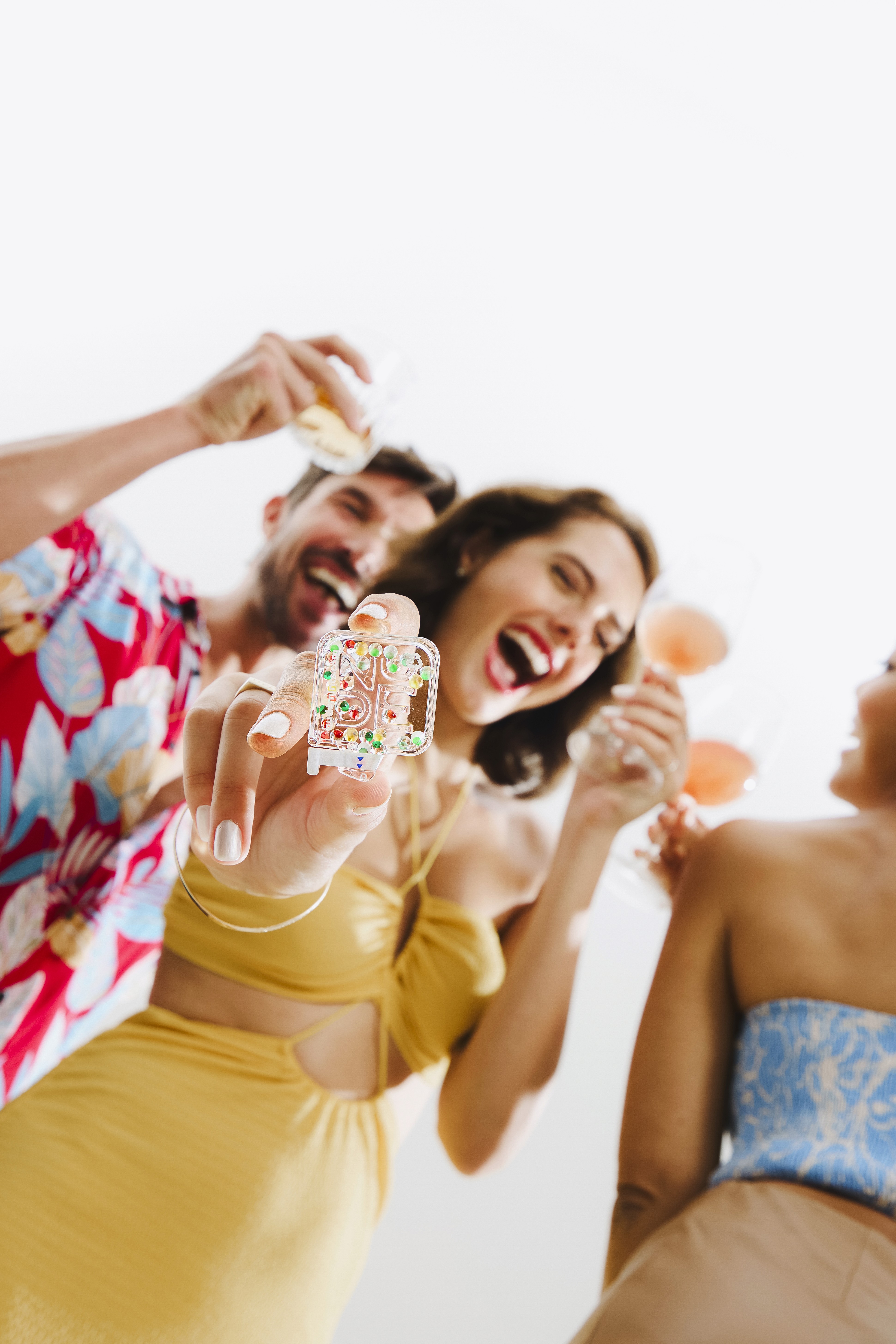
contextual lifestyle moments - pre-meeting, post-coffee, first date.
Every brief included concept rationale, format guidance, key messages, CTA direction, and caption examples. The goal was content that could function as genuine UGC and as paid media simultaneously - high authenticity, high versatility, maximum shelf life.
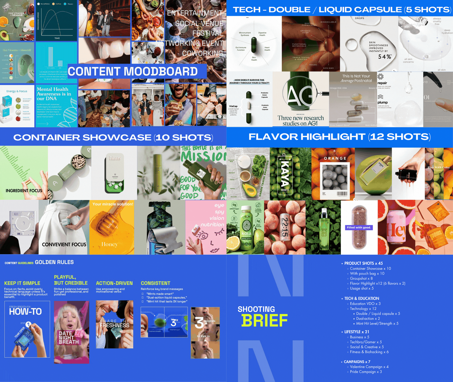
CONTENT SYSTEM & SHOOT BRIEF
To sustain the relaunch across three to six months of publishing without losing consistency or momentum, I developed a comprehensive shoot brief covering 85 pieces of content - planned, categorized, and mapped to specific use cases before a single frame was shot.
The content ecosystem was structured across four pillars:
Brand & Promotional (15–20%)
Education & Useful Content (20–30%)
Lifestyle & Relatable (30%)
Community & UGC (15–20%)
Each pillar serves a distinct role in the consumer journey - awareness, understanding, desire, and trust — and the percentage allocation was built to prioritize what the brand actually needed most: education and lifestyle content that could convert skeptics into believers.